
The Switch to GA4 and What You Need to Know
To better understand the consumer journey, you will need to understand a bit more about Google Analytics 4. GA4 is ...

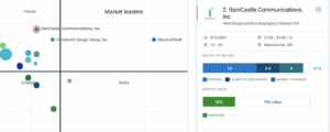
The Manifest Hails RainCastle Communications, Inc. as Boston’s Best Reviewed Branding Agency for 2023
It’s almost been three years since we at RainCastle Communications, Inc. embarked on this journey to help companies solve whatever ...

CoronaScale
Part 5: CoronaScale In scale, relationships matter. So does size, although bigger is not always better. Scale is one of ...

CoronaUsability
Part 4: CoronaUsability For large websites, we conduct usability testing because the cost of launching a site on which ...

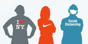
CoronAlignment
Part 3: CoronAlignment We've lost alignment over social distancing and mask wearing As designers, we always look to achieve balance, ...
Corona Branding
Part 2: CoronaBranding It was a well-thought-out branding decision to call it ‘social distancing.’ ...

The Pandemic Through a Designer’s Eye (Clone)
That the world is living though a unique moment is the rare fact upon which we all agree. The Pandemic ...
The Importance of Hiring the Right Branding Company
The Importance of Hiring the Right Branding Company ...
