
An Effective Web Design Strategy Starts with Your Brand
We’ve talked about Market Strategy, Brand Strategy and Content Strategy, so why do we need a Web Design Strategy? Because, of all of these strategies, only your Website Design Strategy is externally facing. Let’s put Website Desgn Strategy into context to clarify how these strategies work in tandem.
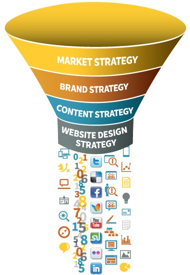 Using a funnel metaphor, your Market Strategy is your highest level strategic decision, in which you define the markets for your products and/or services and determine whether your market approach is industry specific, solutions or applications-focused or some combination.
Once this is determined, your Brand Strategy encompasses the way you describe what you do, for what audiences with a compettive value statement, which sets you apart from your competition. You socialize this brand internally, and externally at every customer and employee touchpoint.
The power of a relevant Content Strategy — based on sound Market and Brand Strategies — is to create a program to disseminate and exchange your valuable content across all media and over time, which leads us to your Website Design Strategy.
Your Website Design Strategy is about making it easier for your customers and prospects to engage with you through your website. A successful website design strategy yields a user experience characterized by:
- Clear messages,often a primary message with other supporting messages (A Messaging Platform)
- Levels of content, from high level overviews on the homepage, to successive levels of depth and detail on interior pages
- Preferably this content is based on real website data and analytics that you’ve been tracking in order to better understand and address the needs of your visitors
- Language that speaks simply to the right audiences and conveys the right benfits
- Copy that speaks in one voice that represents the “brand personality” you identified during the Brand Strategy phase
- Content offers — which you identified in the Content Strategy phase — with bold, clean, “download” buttons
- A “library” of interchangeable content offers utilizing a consistent visual design that grabs the reader’s attention
- Uncluttered overall visual design that uses images, color, type and scale to guide the visitor in a predictable path toward relevant content
- Design that is “Responsive” allowing tablet and smartphone users to enjoy the same satisfying experience they get on the desktop
- Enough links to encourage visitors to learn more on other pages of your site, but not so many links as to be interruptive
- Interactivity where it matters – Be careful not to make the experience too kinetic, which can be distracting. Use diagrams with rollovers too reveal secondary levels of information, infographics that tell a business story and video where the human touch makes content more engaging
These key user experience attributes of a Website Design Strategy can consistently be achieved when your site is based on well-considered Market, Brand and Content Strategies.
Below are some examples of effective websites that use these principles.
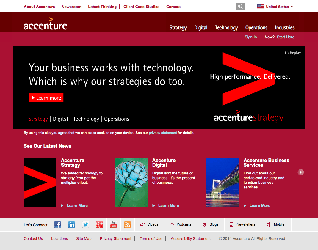
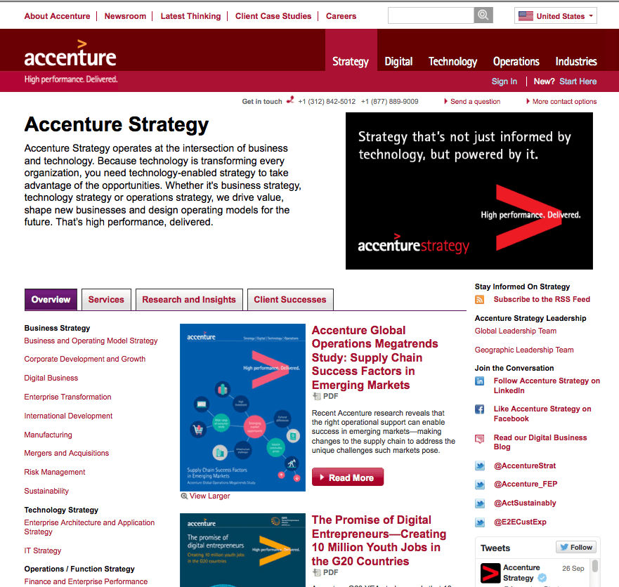
Accenture has a strong design strategy that begins with the ubiquitous tagline, “High performance. Delivered.” It is visually branded with the carrot symbol, which originates from the logo. The use of the color red is distinctive and bold. The homepage is a simple design with most of the real estate used for brand messaging plus three content offers below. And the main nav has but five options that when rolled over, reveal a very deep, yet accessible information architecture. Typical secondary pages use a tabbed structure to reveal content in a way that is not overwhelming, while attention-grabbing visuals bring the eye down the page to important content offers. Solid messaging, consistent visual branding, deep content and design that serves a larger purpose = great user experience.
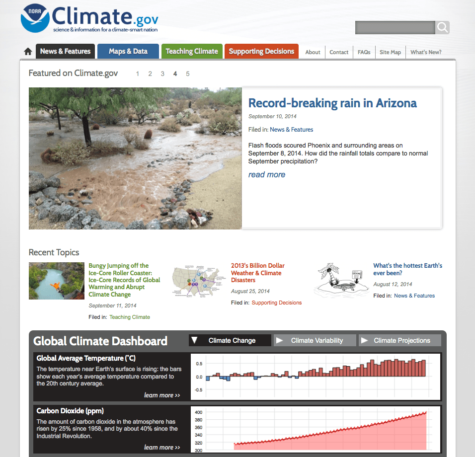
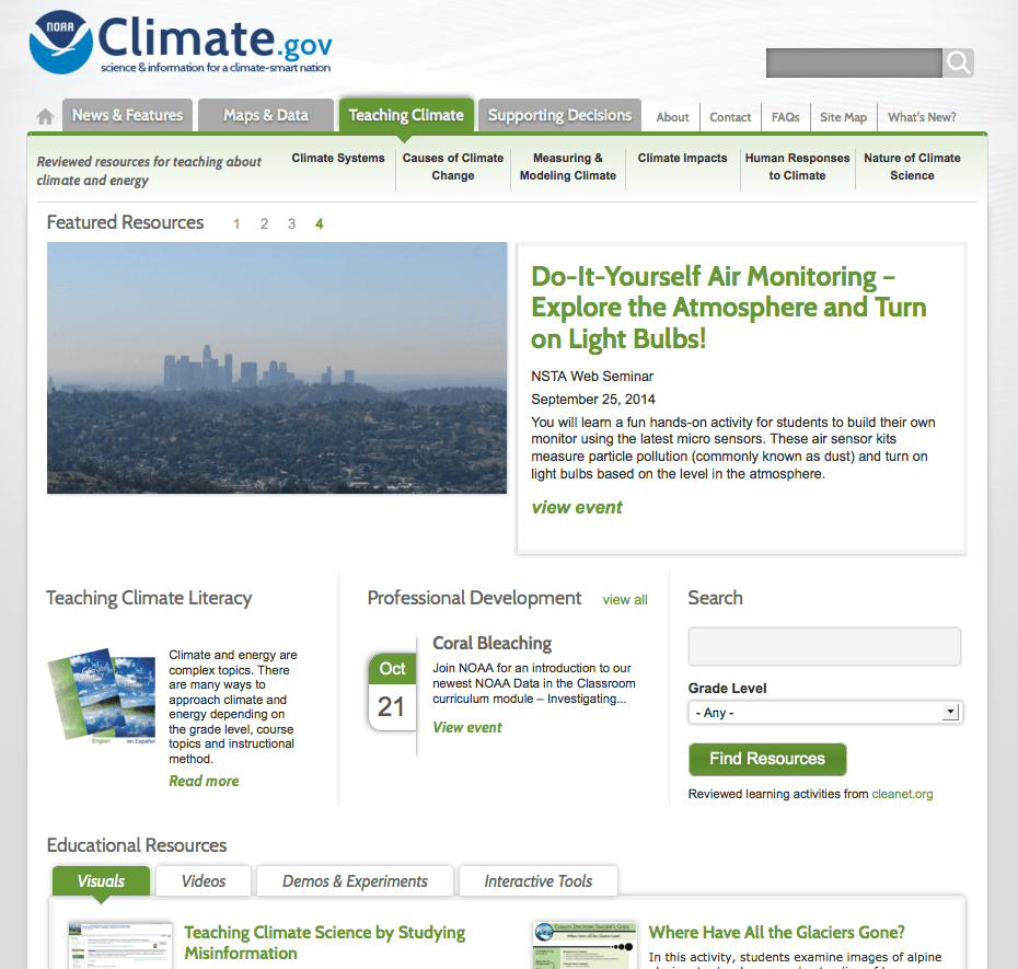
NOAA Climate.gov provides “science and information for a climate-smart nation.” This mission is encapsulated in the tagline beneath the logo and makes it clear that this is a public service, education website. The design is clean and the main real estate utilizes a carousel of educational articles for public consumption. Key navigation is color coded and broken into categories for the public, for educators, and for scientists. Scrolling down, one sees a series of scientific dashboards that lend credibility and gravitas, not to mention real data, to the visual presentation.
Through these examples and the design principles I’ve outlined — which they embody — you have the tools with which to examine your own website. Do you have a viable website design strategy? Feel free to contact us to learn more about how a design strategy will improve your user experience and generate more qualified traffic that converts to new business.