
Five Best Practices for Websites & Brand Messaging
Where brand messaging and web design intersect, successful websites result. This is the lens through which discussions of web best practices and trends are best viewed. Best practices, like trends, are constantly evolving measures, but where trends are a measure of popularity, best practices are about quality standards. Here, I offer a mix of universal best practices, and with the ruthless speed-of-change in mind, a few that reflect the current era of web design.
Customer-First Design
Most of us have heard of mobile first design, which I’ll touch upon later, but surprisingly little attention is paid to “Customer-First Design,” a new term for a universal idea. As websites have become second nature, you as a business person, are familiar with and attuned to what you like or don’t like in a website. But are you as attuned to what your customer would like to see or learn when visiting your site? That’s Customer-First. It may seem obvious, but if you’re like most people, it’s hard not to default to your own preferences, versus channeling the prospect or customer visiting your site for the first time.
I’ve seen and hopefully helped many clients experience a mind shift during a website design process by compartmentalizing what they like and putting themselves in the shoes of their customers, whose needs, expectations and taste may not be aligned with their own. In helping our clients take a Customer-First Design approach, we prompt with questions like:
- What is the value you provide your customers?
- What is the experience you need your visitors to have on your website?
- What do you want your viewers to do on your website? Read an article? Register for a demo? Call you?
- What tools can we employ that your audience will find most useful? Testimonials? Video testimonials? Infographics? Demos? Solutions focus?
- How visually oriented is your audience? How much would they be willing to read?
When you take a moment to inhabit the world of your customer, good web design results.
Messaging Drives Design
I’ve found this to be pretty universal in B2B web design. The website is the intersection of brand messaging and design. A successful website needs both disciplines; they are interdependent. I’ve lost count of the number of businesses who have come to us seeking a new website without having compelling or differentiating brand messaging. A compelling idea or brand promise sparks a unique web presence and a cohesive visual identity.
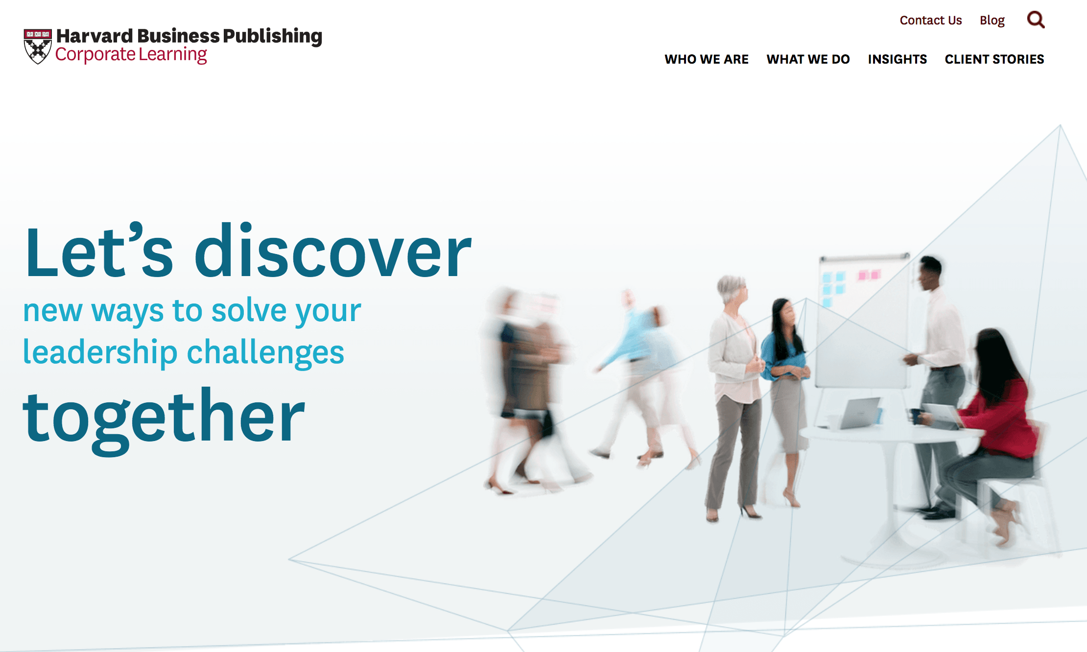
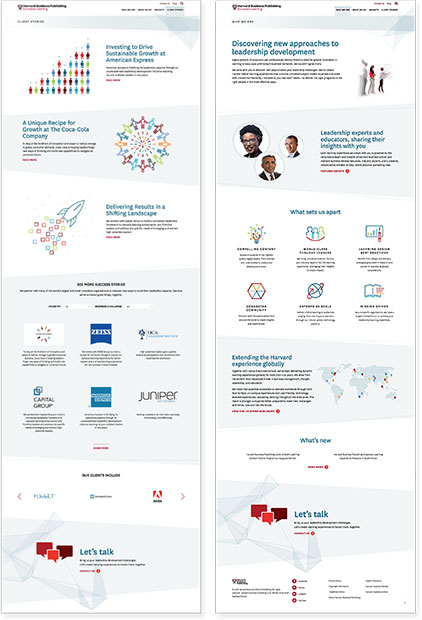
Our recent website for Harvard Business Publishing Corporate Learning is an example of how brand messaging drives design and in fact spawned an entirely new visual language for them, which we also applied to animated videos, PowerPoints and more. Their modern co-collaboration brand theme, led us to a clean design with images of people working and moving in small groups to support the message. Even the way in which the headline is designed, represents a collaboration of two ideas: Discovering together and solving leadership challenges.
Flowing Layouts
A more recent best practice, which may become a trend, is the idea of web layouts that “flow” rather than appear blocky and having a different design for each panel, as you scroll down the site. The entire user experience of the modern website, necessitating a long scroll from top to bottom, originated with mobile devices, which have always required scrolling due to their small, vertical format. And since a majority of B2B website users are on their desktops, we are conceiving of a web page in a different way, which is what I call “Flowing Design,” which works beautifully on both desktop and mobile.
Flowing design envisions the entire scrolling page as one landscape for telling a multi-tiered story. I return to RainCastle’s site for Harvard. Note that there are no “panels” per se, but rather a gentle framework of diagonals that effectively stair-step the user through the different levels of the story ending with the CTA. Web audiences are craving an experience that doesn’t look and perform like same old. This approach is a worthy option.
Hierarchical Storytelling
The B2B website story should begin with the big picture and guide the user through a message, which begins at the highest level. Each successful panel cascades to provide more color and detail, including, or ending with, a call-to-action (CTA), for the visitor to connect directly. Too often though, B2B sites leave their audience wondering: “What does this company do? What are they about? What do they want me to do?”
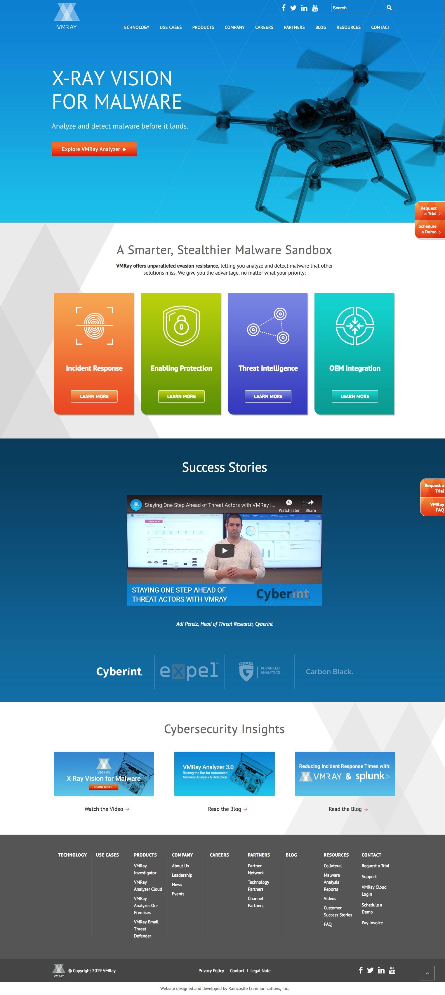 The website we designed for Cybersecurity software provider VMRay, illustrates this point, as well as the earlier point about message driving design. Right away the web visitor reads the headline, “X-ray Vision for Malware,” which suggests what they do and provides brand recognition. Immediately below is the descriptive subhead, “Analyze and detect malware in its natural habitat,” answering the “what do you do?” question. In the panel below, we drill down to the next level, illustrating four of the key pain points VMRay’s products address for their customer, AKA “Value.”
Below that, video testimonials validate the two panels above, followed by a panel with links to expert content and the CTA. This is classic hierarchical storytelling on the web. First, ground your audience and then guide them through the story and finally empower them to learn more or contact you.
Mobile 2nd …With a Bullet
Mobile first has been the default assumption for best practices in web design since shortly after responsive websites were born. Like most trends, it originated from the consumer world where mobile devices are becoming the dominant format for viewing websites, and from progressive web designers, trying to stay ahead of the usability curve.
In the B2B market, mobile usage is clearly growing, but the reality is that a majority of customers still access websites from the desktop. Many B2B brands are surprised to see 80% or more of their website traffic is originating on desktop computers between 9am and 5pm. As a result of mobile reality, when we design a website, we maintain a mobile consciousness, in developing desktop design. Our internal reviews ensure that anything we design for the desktop will naturally reconfigure for mobile, in a way that maintains the hierarchical storytelling we’re delivering on the desktop.
Do you see other best practices and trends not included here?